If you've ever opened a trading app like Robinhood, Schwab, or Fidelity, you've seen candlestick charts. Every 10 minutes (or whatever interval you pick), the app draws a little bar showing four numbers: the opening price, the closing price, and the highest and lowest prices reached during that window. Most people use candlesticks to spot patterns — doji, hammers, engulfing bars the bread and butter of technical analysis. But there's a different question worth asking: can a single candlestick tell you, with real statistical rigor, how volatile an asset actually is right now?
The answer is yes. And the method for doing it — call it the Optimal Candlestick (OK) estimator — is simple enough to compute by hand on a calculator.
The Problem: Good Volatility Data Is Expensive
Professionals who study “spot volatility” — how much an asset's price is jumping around at a specific moment — typically rely on institutional-grade, tick-by-tick trading data from expensive databases. That data costs real money and isn't available to ordinary investors, especially those trading in less-developed markets.
Meanwhile, retail traders have something free and readily available: candlestick charts. The core insight here is that a candlestick contains far more information than people realize. It's not just a picture — the height of the wicks and the size of the body encode real statistical signal about volatility.
How the OK Estimator Works
The formula itself is refreshingly simple:
σ = [0.811 × (High − Low) − 0.369 × |Close − Open|] ÷ √(session duration)
In plain English: take the candlestick's high-low range, multiply it by about 0.81. take the absolute size of the body (the open-close move), multiply it by about 0.37. subtract the second number from the first; then divide by the square root of how long the candle spans.
Two things jump out:
- The weights (0.811 and −0.369) aren't arbitrary. They're mathematically derived so the estimator is unbiased and has the lowest possible error among all linear combinations of range and body size.
- The body size gets a negative weight. This is the counterintuitive part — most traders assume a bigger open-to-close move signals more volatility. In fact, the opposite can be true: if two candles have the same overall height, the one with a smaller body (long wicks, small body) is actually the more volatile one.
Why “Doji” Candles Expose a Hidden Flaw in Simple Volatility Proxies
A long-wicked, small-body candle is called a doji in technical analysis — literally “mistake” in Japanese. Dojis aren't just a chart pattern to watch for; they're a real statistical trap
If you tried to estimate volatility using only the open-close return (a common shortcut in finance), a doji candle would tell you volatility was near zero — because the price barely moved from open to close. But that's clearly wrong: the price actually swung wildly within the session, it just happened to snap back to roughly where it started.
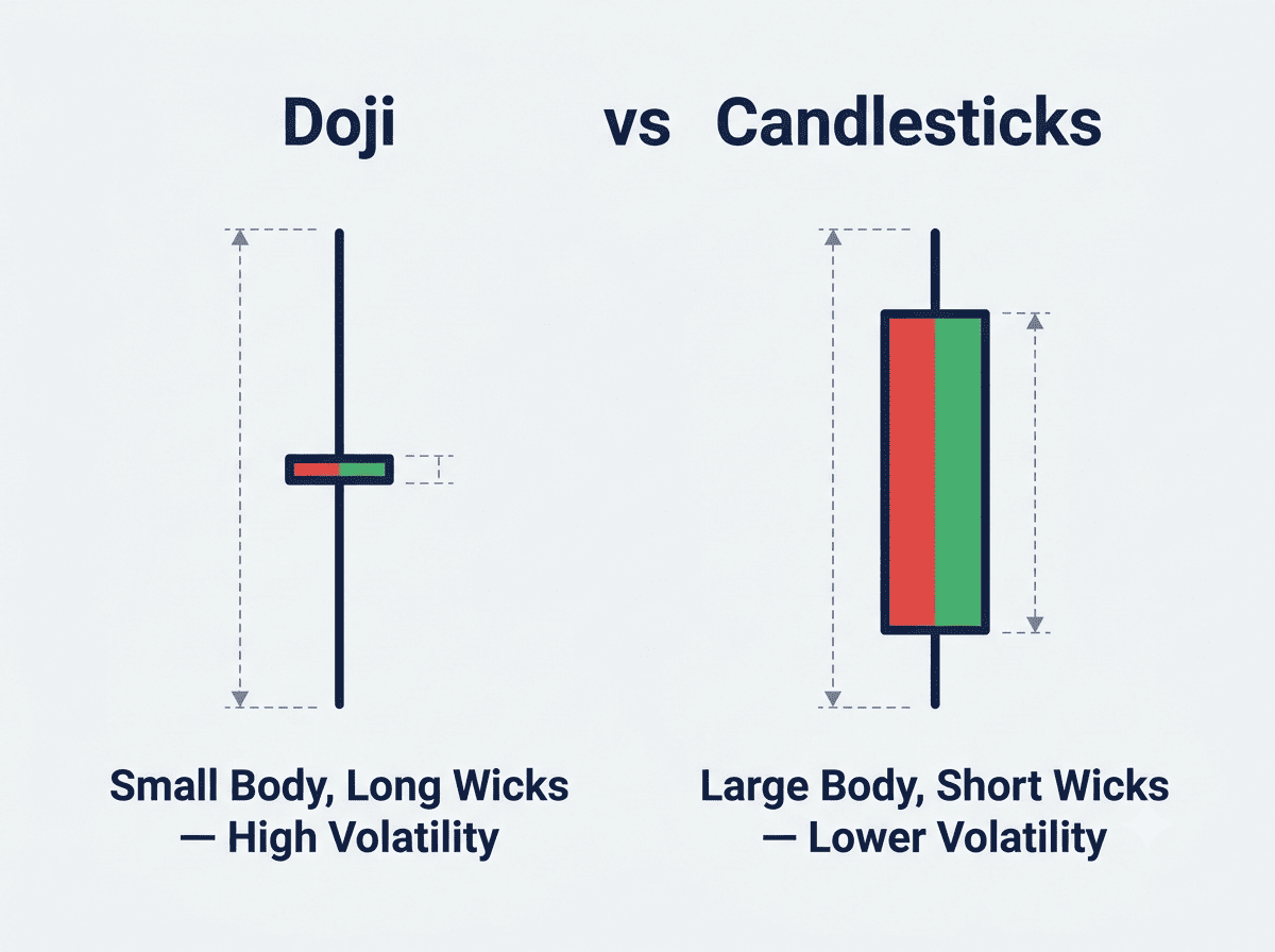
Doji vs Candlesticks
A real example shows up in SPY (the S&P 500 ETF) data: during one 10-minute window, an open-close estimator produced a volatility reading of just 0.055% per day — implausibly low — while the OK estimator, using the whole candlestick, correctly flagged that volatility was over 1%. The open-close method was quite literally throwing away the wick data that mattered most.
The Math Behind the Confidence Intervals
Here's the clever part. Normally, to build a confidence interval for something like volatility, you need many observations so the Central Limit Theorem can kick in. But a single candlestick is just one data point — you can't average your way to certainty.
Instead, there's a technique called “coupling.” Under a standard model of how prices move, the estimation error of the OK estimator behaves exactly like a known, fixed mathematical object — a function of Brownian motion whose exact distribution can be simulated with millions of computer trials. Because that distribution is known and doesn't change with sample size, you can build a mathematically valid confidence interval from just one candlestick.
The resulting 90% confidence interval is:
[0.636 × σ*, 1.485 × σ*]
That's it. Multiply your OK estimate by 0.636 and by 1.485, and you have a range you can be 90% confident contains the true volatility — computed from a single 10-minute candle, on a basic calculator.
How Good Is It, A Head-to-Head Comparison
Simulation testing shows the OK estimator dramatically beats the naive alternatives:
- Compared to using only the open-close return, the OK estimator's confidence interval is roughly 7 times tighter at the 90% level.
- Compared to using only the high-low range, it's about 15% tighter.
- Even more strikingly, a retail trader using one 10-minute candlestick can get within about 6% of the precision of a professional using ten 1-minute return observations — essentially professional-grade data sampled ten times more often. A free candlestick chart gets you nearly all the statistical power of expensive, granular institutional data.
Real-World Test: Powell's Testimony and a Bond-Market Volatility Spike
To see the method work outside a simulation, consider a real, high-stakes event: Fed Chair Jerome Powell's semiannual monetary policy testimony to Congress on February 23, 2021. At the time, the 10-year Treasury yield had been climbing for months, and markets were on edge about whether the Fed would stay accommodative.
Using 10-minute candlesticks for the 10-year Treasury yield, SPY, ARKK (a tech-heavy ETF), gold (GLD), and Bitcoin, the OK estimator produced a volatility path that tracked the news almost perfectly:
- Volatility on the Treasury yield jumped to its daily peak of 11 basis points right as the two lead senators gave politically charged opening statements — before Powell had even spoken.
- It spiked again around 6 basis points roughly an hour later, precisely during an exchange between Powell and Senator Mike Rounds about bank capital rules (the “SLR exclusion”) — a policy question the Fed left unresolved that day and then acted on weeks later.
- Volatility calmed down during the stretches when Powell reiterated a predictable, dovish policy stance.
By contrast, running the same event through the naive open-close estimator produced a jagged, erratic-looking volatility series that jumped around for no economically coherent reason — a vivid illustration of why the extra math matters in practice, not just in theory.
What This Means for Everyday Traders
You don't need a PhD to use this. The practical recipe is:
1 Grab any 10-minute (or other interval) candlestick open, close, high, low.
2 Compute 0.811 × (High − Low) − 0.369 × |Close − Open|.
3 Divide by the square root of the time interval (expressed as a fraction of a trading day).
4 Multiply the result by 0.636 and 1.485 to get a 90% confidence range.
That's a real-time, statistically grounded volatility estimate — useful for gauging liquidity conditions, assessing margin-call risk, or sizing options trades around volatility — computed entirely from data that's already sitting in your brokerage app.
The Bigger Picture
What makes this approach notable isn't just the formula — it's the reframing. Conventional wisdom on spot volatility assumed you needed lots of high-frequency data and law-of-large-numbers-style consistency. It turns out a single well-chosen observation, combined with the right theoretical tool (coupling to a known distribution instead of relying on the Central Limit Theorem), can get you most of the way there.
This builds on classic range-based volatility work from decades past, but pushes it further into a modern, jump-robust, leverage-effect-aware framework — and, crucially, adds valid confidence intervals, which those older methods never provided.
intervals, which those older methods never provided. For retail investors who've long been told they're at an information disadvantage compared to institutions, this is a rare bit of good news: with just a candlestick chart and a calculator, you can get remarkably close to professional-grade volatility estimates.
Cosmic View
For years, retail traders have been told the same story: real volatility data is expensive, complicated, and reserved for institutions with access to tick-by-tick feeds. The OK estimator flips that narrative. It shows that the candlestick you're already staring at on Robinhood or Fidelity isn't just a picture for spotting patterns — it's a genuine statistical instrument, one that can rival professional-grade data with nothing more than basic arithmetic.
The bigger lesson here goes beyond the formula itself. It's a reminder that sometimes the "advanced" tools institutions rely on aren't fundamentally different from what's freely available — they just require knowing how to look at the data correctly. A single candle, read the right way, can tell you more than a dozen half-understood indicators ever could.
So next time you glance at a chart, don't just look for a hammer or an engulfing pattern. Do the quick math. That wick you almost ignored might be the most honest number on the screen.